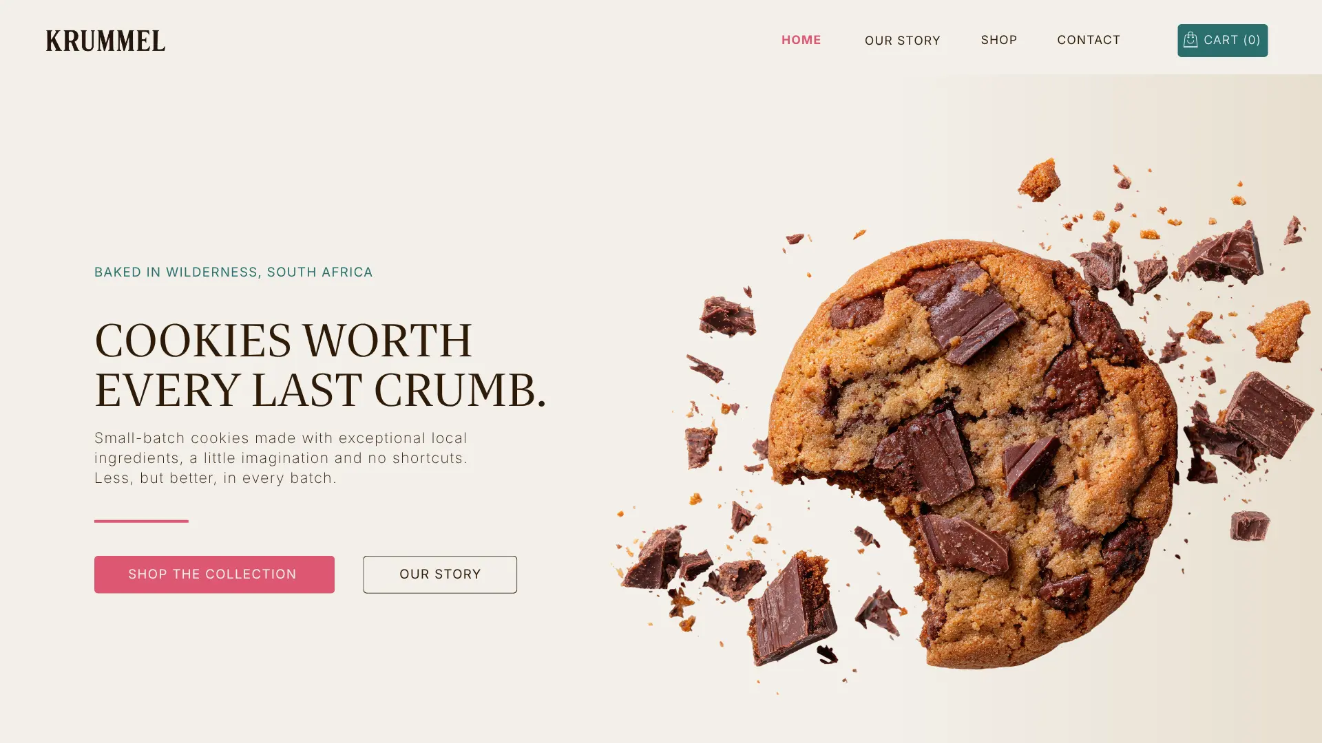
Turning a beautiful product idea into a brand worth every last crumb.
KRUMMEL started with a genuinely good product.
The care was already there. What did not exist yet was a brand capable of communicating it.
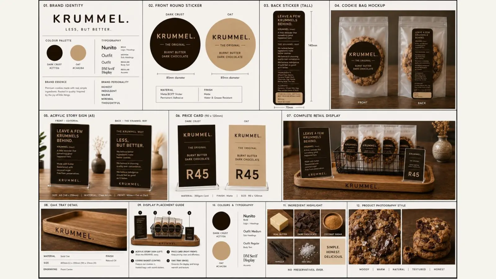
The starting point
A beautiful product. A clear ambition. A brand still waiting to be found.
Rochelle was building a premium small-batch bakery brand in Wilderness, South Africa, around exceptional cookies made slowly and intentionally.
The challenge was not simply to make KRUMMEL look premium. It was to define what premium meant for this particular brand.
Read the full KRUMMEL storyStrategy, identity and packaging↓
01 / The starting point
Considered, not precious.
Rochelle came to Strachan Creative with the name KRUMMEL, a clear passion for the product, early visual references and an ambition to build something much bigger than a home-baking business.
The brand could not feel sterile or overly luxurious. It could not become another beige artisan food brand. And because Rochelle loves experimenting with flavours, it needed enough personality and flexibility to play.
02 / Strategy before aesthetics
Less, but better.
Before designing anything, we unpacked Rochelle’s vision, ingredient philosophy, production process, ideal customers and the experience she wanted KRUMMEL to create.
One idea kept resurfacing: fewer shortcuts, thoughtfully chosen ingredients and fewer products done exceptionally well rather than an endless menu done adequately. Quality first.
Early thinking touched on indulgence “without guilt”. Rochelle challenged that language, and rightly so. KRUMMEL should not have to justify a cookie because it is somehow more virtuous. It should be eaten because it is really, really good. Pleasure does not need an apology.
03 / Finding the brand world
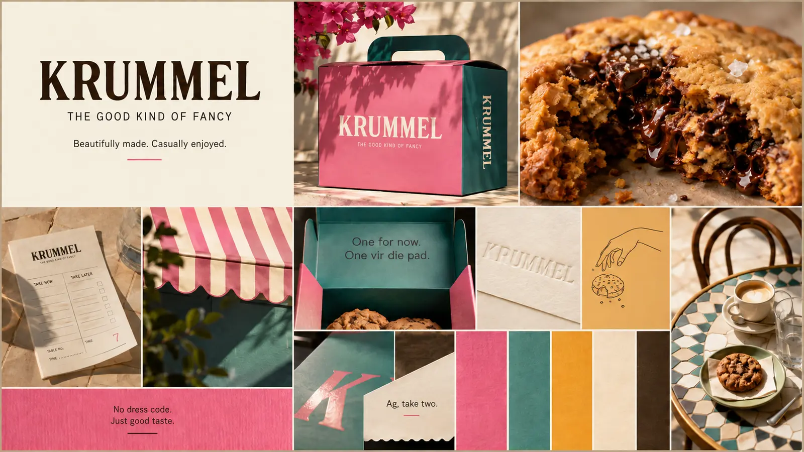
The Good Kind of Fancy.
The chosen creative territory took cues from the charm of a French café without losing the warmth, generosity and personality of a South African bakery.
Premium, never snobbish. Playful, never childish. Beautiful, but still inviting enough to make you want to tear open the packet immediately.
We moved away from predictable luxury cues and built a more memorable world through confident typography, warm pinks, deep teal, stripes, illustration and just enough visual wit. KRUMMEL means “crumb”, which led naturally to the line: Worth every last crumb.
04 / Designing for the product
Made to work beyond the presentation.
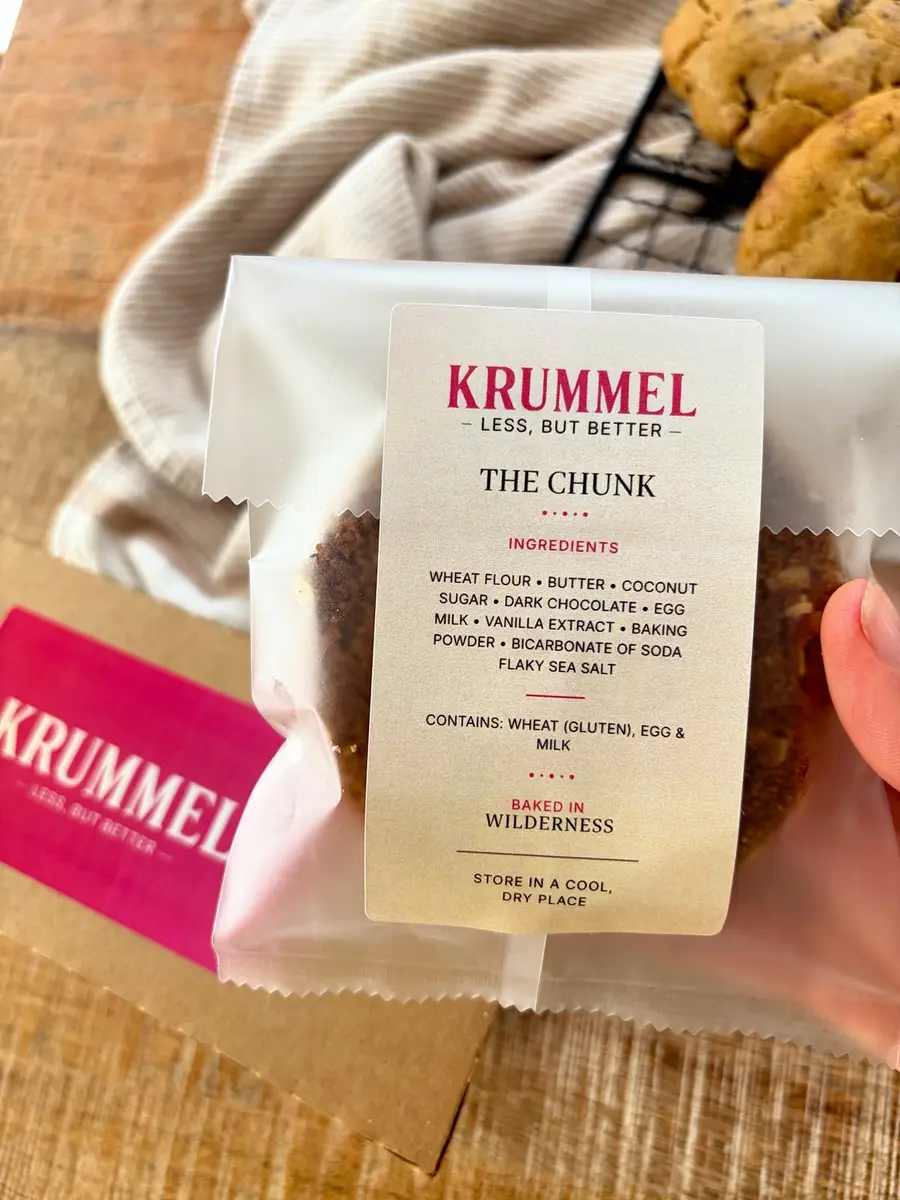
The identity had to work on a real packet, at a real size, coming out of a real printer. Packaging was therefore developed alongside the identity itself.
We tested label proportions, information hierarchy, typography, colour, ingredient formatting, allergen information and small-scale legibility. Concepts that looked beautiful on screen were refined when they did not translate strongly enough into production.
The final system combines shelf presence with ingredient transparency and the line: Baked in Wilderness, SA. It feels distinctive without looking mass-produced.
05 / Building a brand, not just a logo
Room to grow without losing the original idea.
KRUMMEL now has a strategic foundation that can guide how it speaks, looks, packages products, develops new flavours and eventually grows into the larger bakery experience Rochelle envisions.
BeforeA beautiful product, a name and a founder with a clear instinct for what she wanted to create.
AfterA distinctive premium bakery brand with its own philosophy, voice, visual language, packaging system and clear place in the market.
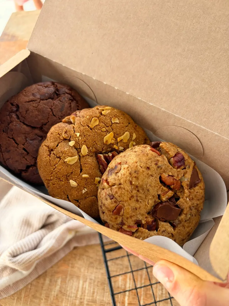
The result
Still small-batch. Still thoughtful. Still a little playful. Just much harder to forget.
Less, but better.
Worth every last crumb.